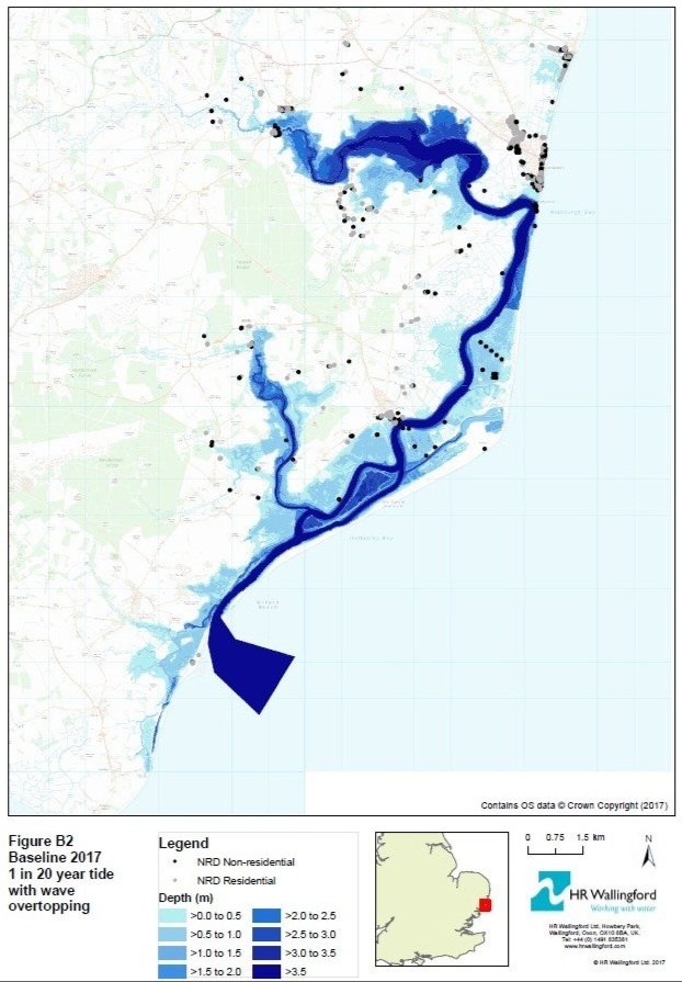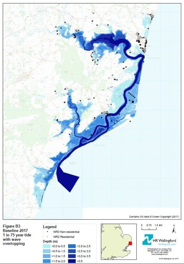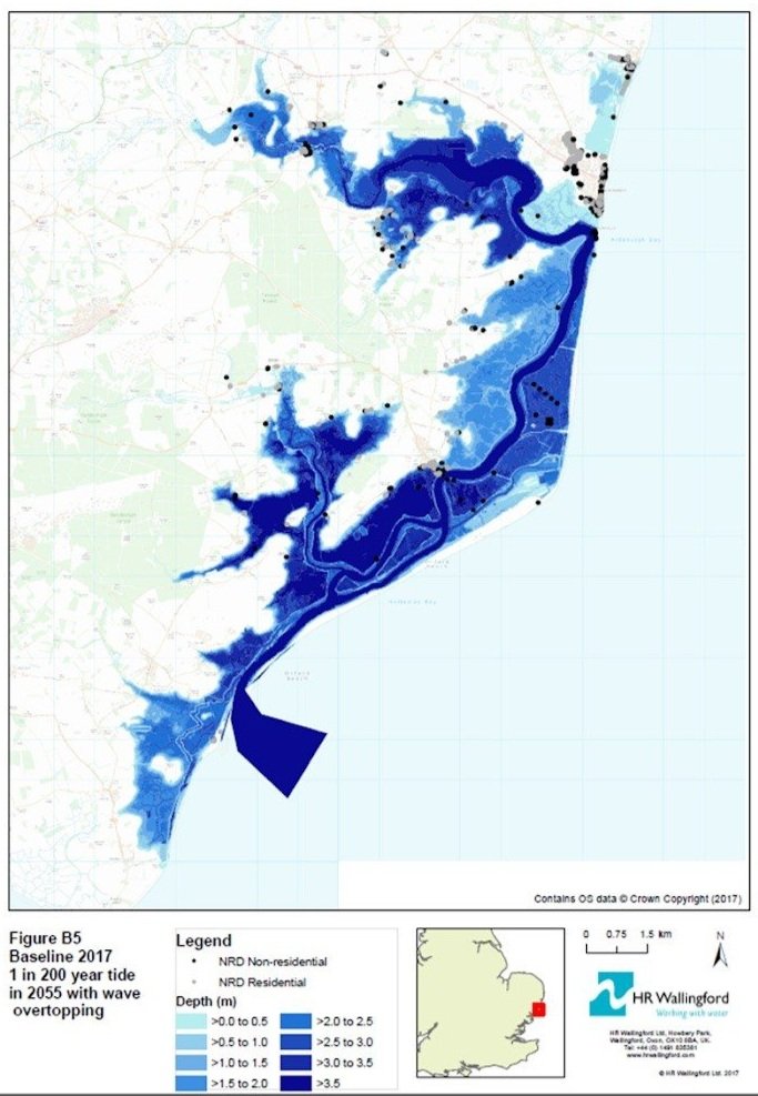
These maps have been produced by HR Wallingford using sophisticated modelling techniques. Their work was published in a 2018 report and indicates what could happen under different surge scenarios. Map 1 is a predicted 1 in 20 year surge, Map 2 a predicted 1 in 75 year surge and Map 3 a predicted 1 in 200 year surge.
Our understanding is that the EA’s own models show similar results.